
REDEFINING LUXURY HOSPITALITY AT DESOLATION HOTEL


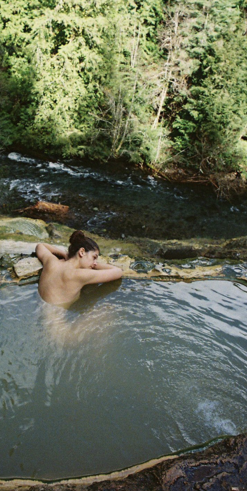
FILM PHOTOS BY MADELINE WESTFALL
Join me in attempting to particulate the journey to developing the brand for Desolation Hotel, a visionary project that pushed the boundaries of traditional luxury hospitality. This remarkable journey spanned over a year, taught me more than I could ever imagine about teamwork, leadership, and all-female (badass) comrades in the process. This case study explores the challenges, triumphs, and transformative moments that shaped the creation of Desolation Hotel, solidifying its position as an unparalleled destination for discerning travelers seeking an immersive and unforgettable experience.
Our adventure begins in South Lake Tahoe, where Studio Ette, an exceptional interior design firm from San Francisco, had already laid the groundwork for an authentic brand and captivating interior design narrative. Joined by a team of talented individuals (that you will meet later), we embarked on a mission to redefine luxury hospitality and create a new category of experience that celebrated nature, adventure, and rejuvenation.
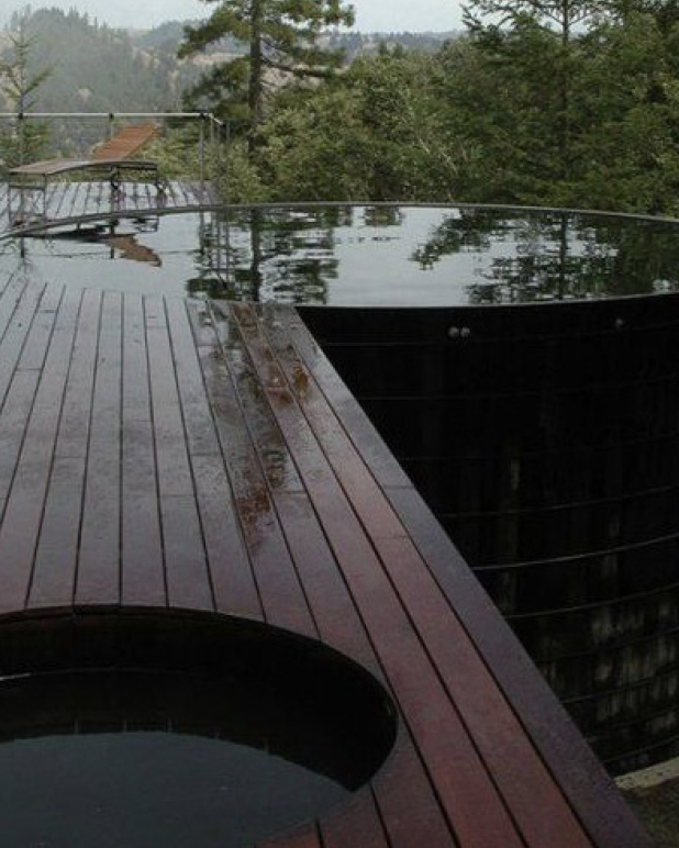
The brand essence of Desolation Hotel is rooted in the concept of sustenance. We envisioned the hotel as a sanctuary, where guests could replenish their spirit of adventure and indulge in the deep enjoyment of the outdoors. Through expert curation and a focus on regeneration, we aimed to feed the inspiration of modern adventurers and support their rest and renewal. Our vision was to enable transformative experiences in nature, seamlessly combining local insight and expertise with the comforts and innovation of modern living.
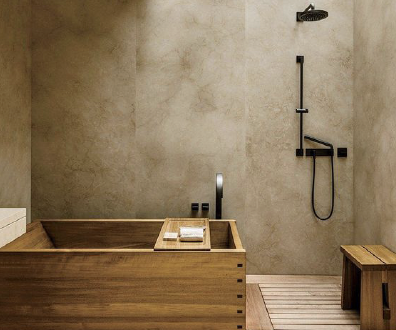
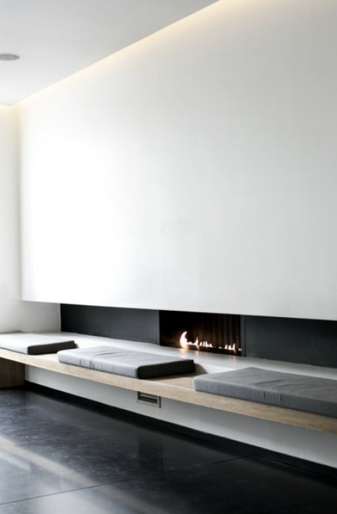
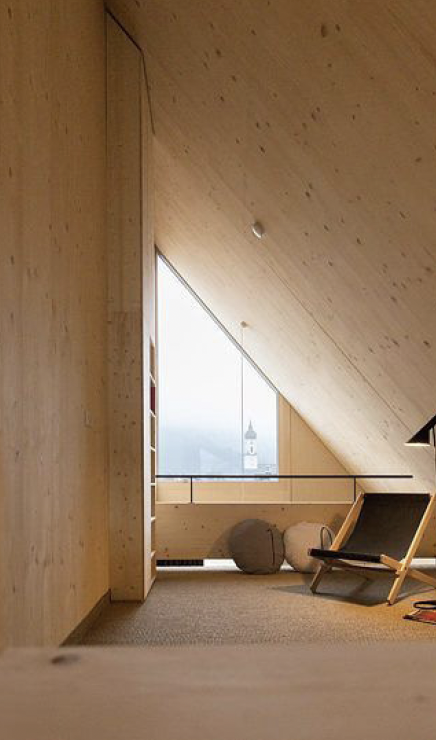
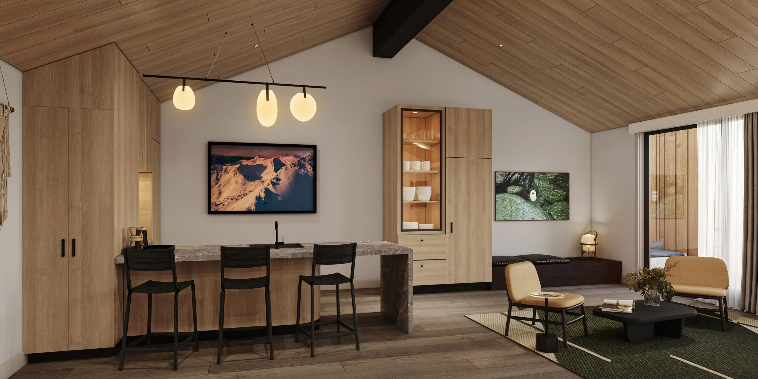
Studio Ette embraced the concept narrative of "The Spring-Fed Grove." This narrative celebrated the harmonious fusion of natural elements and human connection, envisioning Desolation Hotel as a place where modern adventurers could experience luxury that nourished both body and mind. Guided by design principles of minimalism with character, hints of Mid-Century nostalgia, and a Japanese inspired approach to design by embracing the imperfect and respect for the natural world.
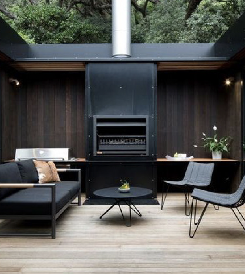
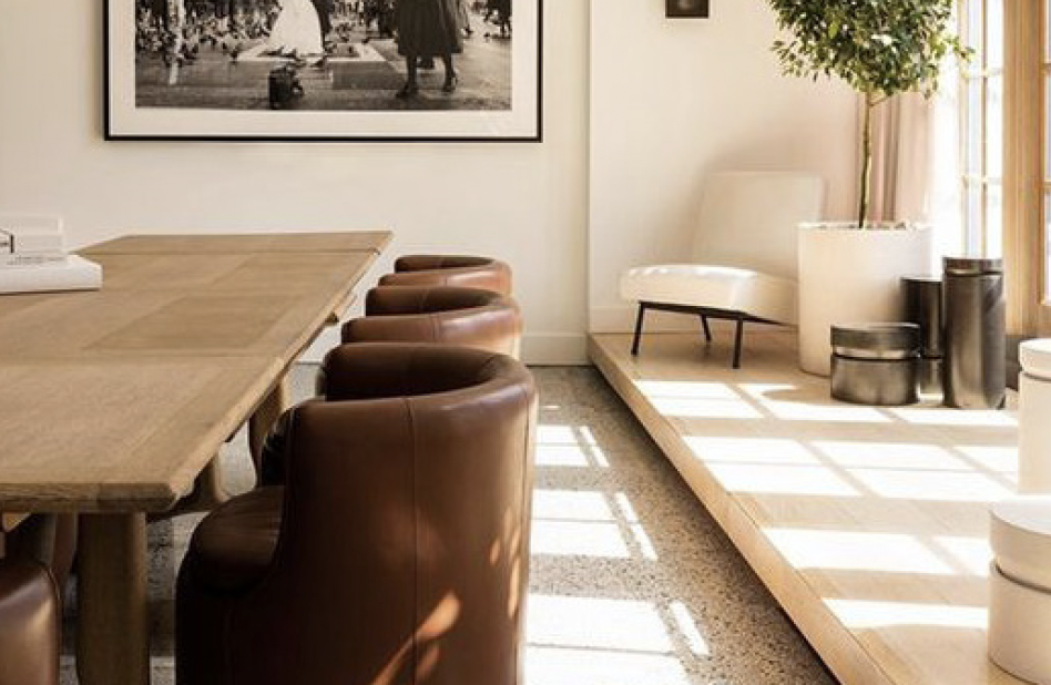
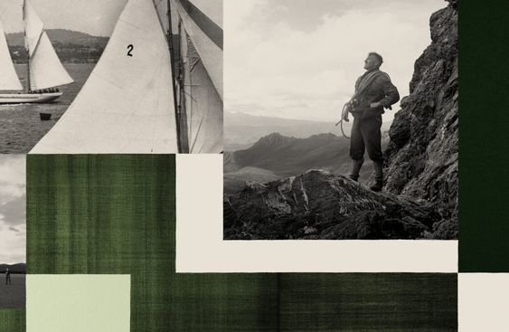
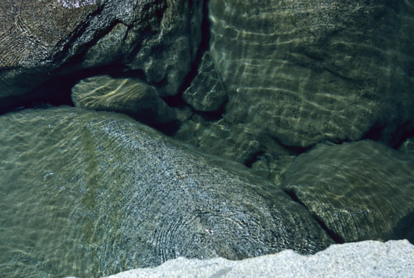
When I stepped on the scene, the overarching brand essence had been defined and the interior was in process. Below are some of the original moodboard images from early presentations.
Design Cues:
Celebrated Heritage. Wabi Sabi Philosophy. The Modern Adventurer.
Every aspect of the brand strategy for Desolation Hotel was driven by meticulous thoughtfulness. I immediately understood that in order to create a brand as thoughtful as the interior, no detail could be overlooked. Each decision, from the choice of materials to the arrangement of visual elements, was carefully considered to reflect the brand's essence. The result was a brand identity that resonated with the refined comforts of urban living while staying true to the rugged beauty of Desolation Wilderness. By infusing the brand strategy with thoughtfulness, the team ensured that Desolation Hotel would provide a truly immersive and unforgettable experience for its guests.
At Desolation Hotel, modern conveniences and eco-luxury commingle with both Japanese tranquility and modern Scandinavian design for a one-of-a-kind South Lake Tahoe experience. Here, we inspire adventure and invite requiescence, providing space for exactly the kind of recharge your battery requires. Balancing nostalgia for the past with appreciation for the present, Desolation Hotel alludes to the natural and uncomplicated days of yesteryear, while modern technology serves as a quiet backbone to the entire resort experience.
After spending more than four decades creating exceptional experiences in the consumer electronics industry, the owners of Desolation Hotel sought to build a community that would synthesize their passion for tech with their love of outdoor exploration. With a focus on delivering exceptional Tahoe experiences both inside the hotel and out, Desolation Hotel is not only a place where modern adventurers can stay and relax during vacation, but also serves as a launching pad for adventure and recreation in this stunning, natural playground.
Desolation Hotel was created by a family that believes in the magic of relationships — connecting with others and connecting with the world around us. As such, we are excited to bring such passion and reverence to the hospitality industry here in Lake Tahoe.


The brand strategy for Desolation Hotel targeted the modern adventurer, who sought meaningful access to nature while maintaining a connection to the amenities and tools of modern life. The hotel aimed to create an inclusive environment that catered to a wide range of guests, but it was optimized to provide an exceptional experience for solo adventurers, couples, and small groups. Whether guests were seeking a short escape or a longer stay, Desolation Hotel was designed to fulfill their desire for immersive nature experiences without compromising on comfort and convenience. The brand strategy aimed to attract adventurous individuals who valued both the beauty of the natural world and the modern luxuries that enhance their overall experience.
Enter, the visual exploration of the brand.

Designing the visual brand identity for Desolation Hotel was a process focused on creating an honest, authentic, purposeful, people-centric, durable, and enduring brand. The goal was to capture the essence of the hotel's unique offerings and create a visual identity that resonated with guests. The brand identity reflected the experience of staying at Desolation Hotel, where guests could unwind and recharge in their private quarters after a long journey or a day exploring the Desolation Wilderness. The visual elements were carefully curated to convey a sense of warmth, comfort, and personal space, inviting guests to kick off their boots, wash away the day's dust, and immerse themselves in relaxation. The visual brand identity aimed to capture the transformative experience that could only be achieved at Hotel Desolation, setting it apart as a destination of exceptional beauty and rejuvenation.
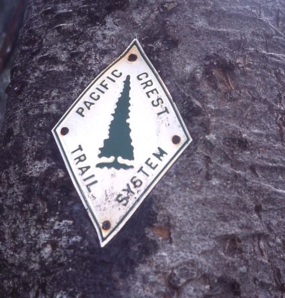
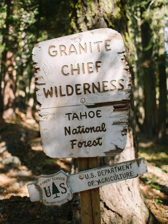
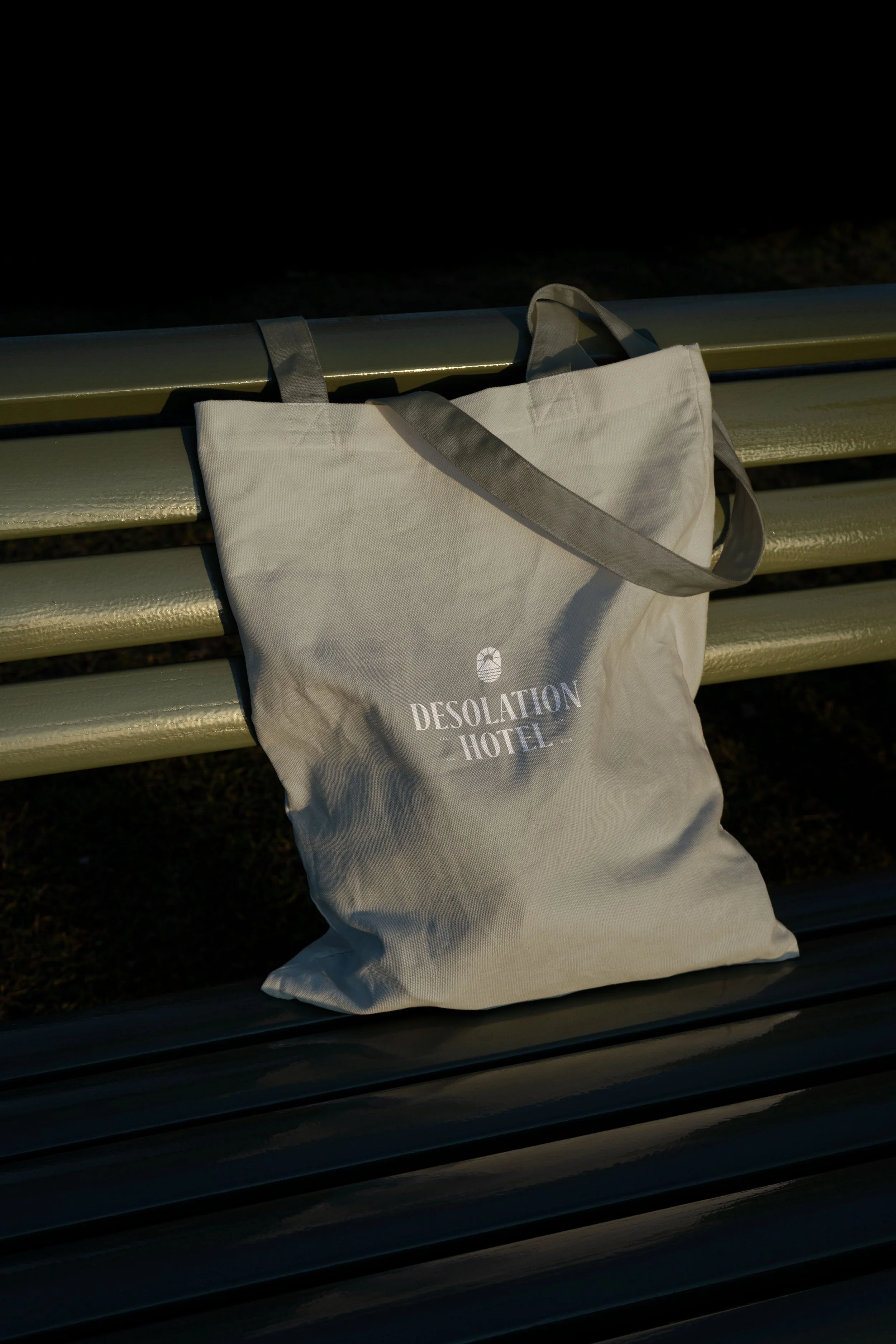
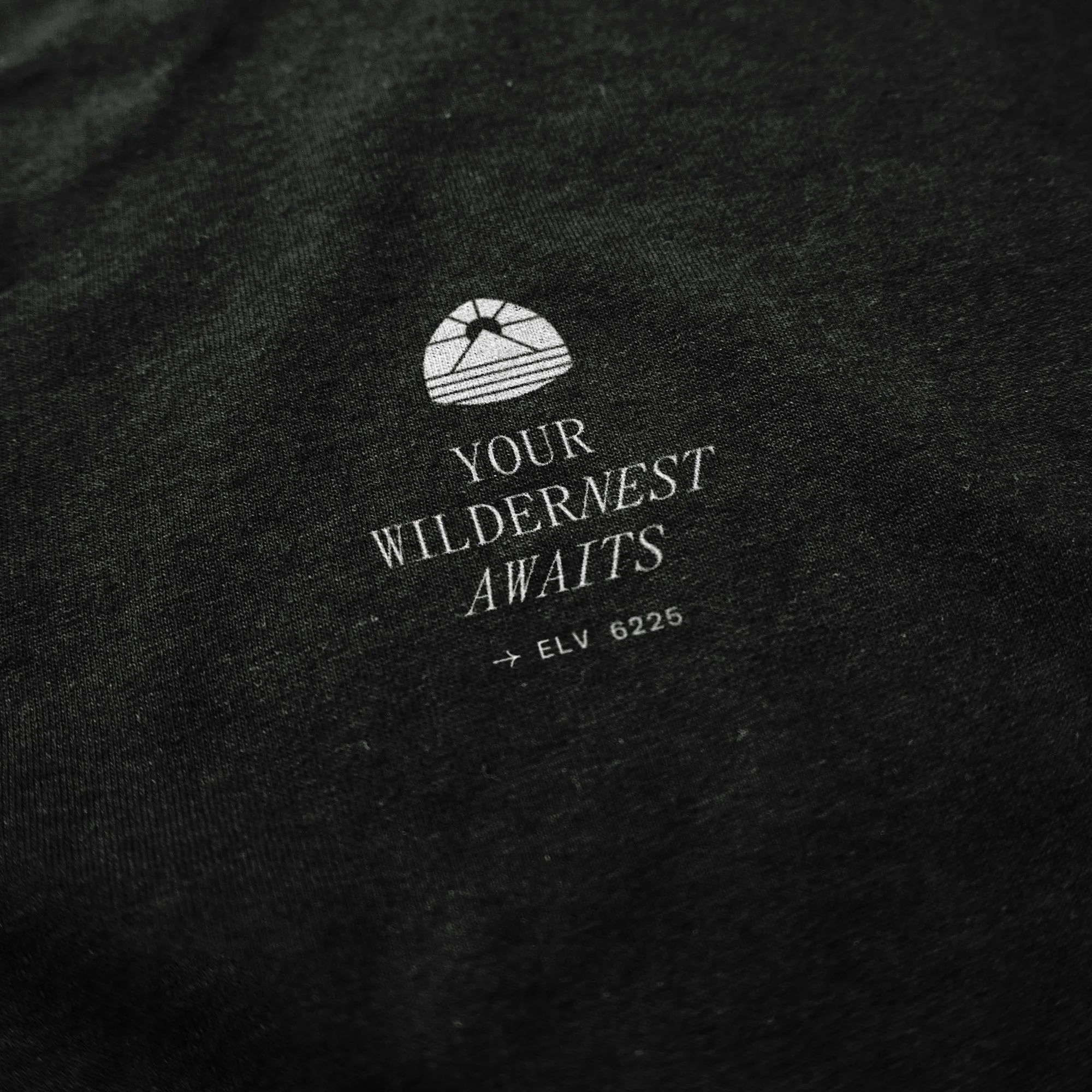
In the end, we opted for a minimalist typographic treatment for the logo, accompanied by a logomark that draws inspiration from the iconic triangular shape of national historic trail signs. These signs hold great significance as they mark important trails and historical routes across the country. With their distinctive shape, they effortlessly catch the eye and provide crucial information to travelers and adventurers. The triangular form not only stands out amidst natural landscapes but also symbolizes direction and guidance, ensuring that visitors find their way along the journey. These signs not only serve a functional purpose but also evoke a sense of heritage and preservation, reminding us of the profound history and stories woven into the trails they mark. As recognizable symbols of exploration and adventure, the triangular shape national historic trail signs inspire travelers to embark on extraordinary journeys through time and nature.
The final logomark for Desolation Hotel features a unique "pill shape” variation that encompasses the essence of the destination. Within this distinctive shape, the logomark artfully combines elements representing the sun, mountains, and Lake Tahoe. This composition captures the spirit of Desolation Hotel's location and its close connection to nature. The inclusion of the sun signifies warmth, energy, and a new day of exploration, while the mountains represent the magnificent Sierra Nevada range that surrounds the hotel. Lastly, Lake Tahoe, renowned for its crystal-clear waters, is symbolized, emphasizing the hotel's proximity to this awe-inspiring natural wonder. Together, these elements within the logomark form a harmonious visual representation of Desolation Hotel's identity, inviting guests to immerse themselves in the beauty and adventure that awaits them.


As the project progressed and took shape, we were fortunate to collaborate with exceptional vendors who played a crucial role in its realization. Madeline Westfall joined our team to seamlessly integrate the branding into the wayfinding and signage design. Ted Hesser worked closely with our adventurous team, capturing breathtaking mountain scenes to create stunning photo art for the rooms. Meanwhile, as I focused on designing the website, Laura Pearce took the reins and skillfully developed a custom, fully functional site. To bring the brand to life through captivating language, Maddie Adams expertly crafted the copy, incorporating its essence into every word and eloquently describing the amenities and rooms. The collective effort of these talented individuals contributed immensely to the success and cohesiveness of the Desolation Hotel project.


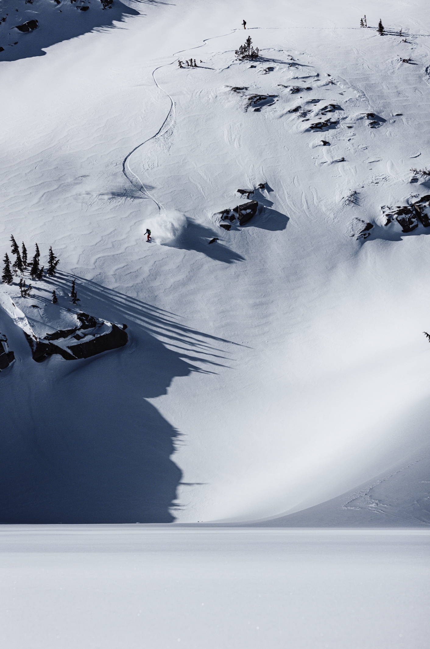
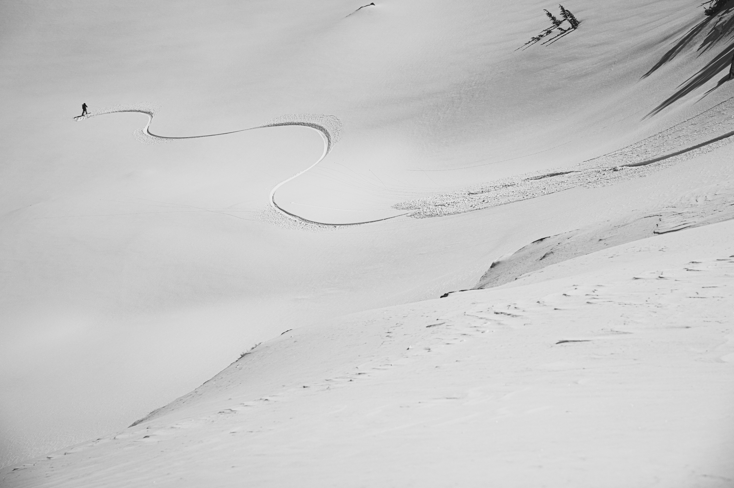
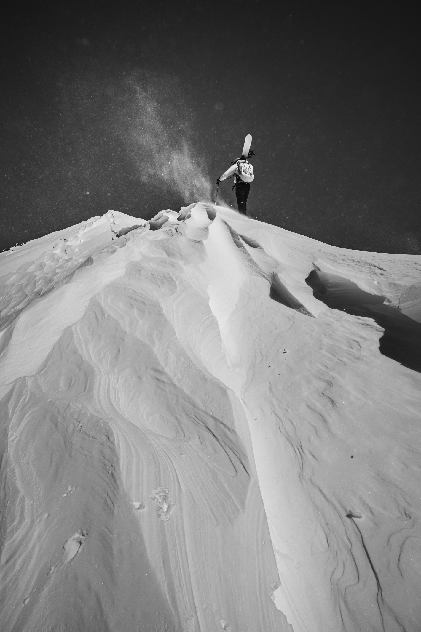
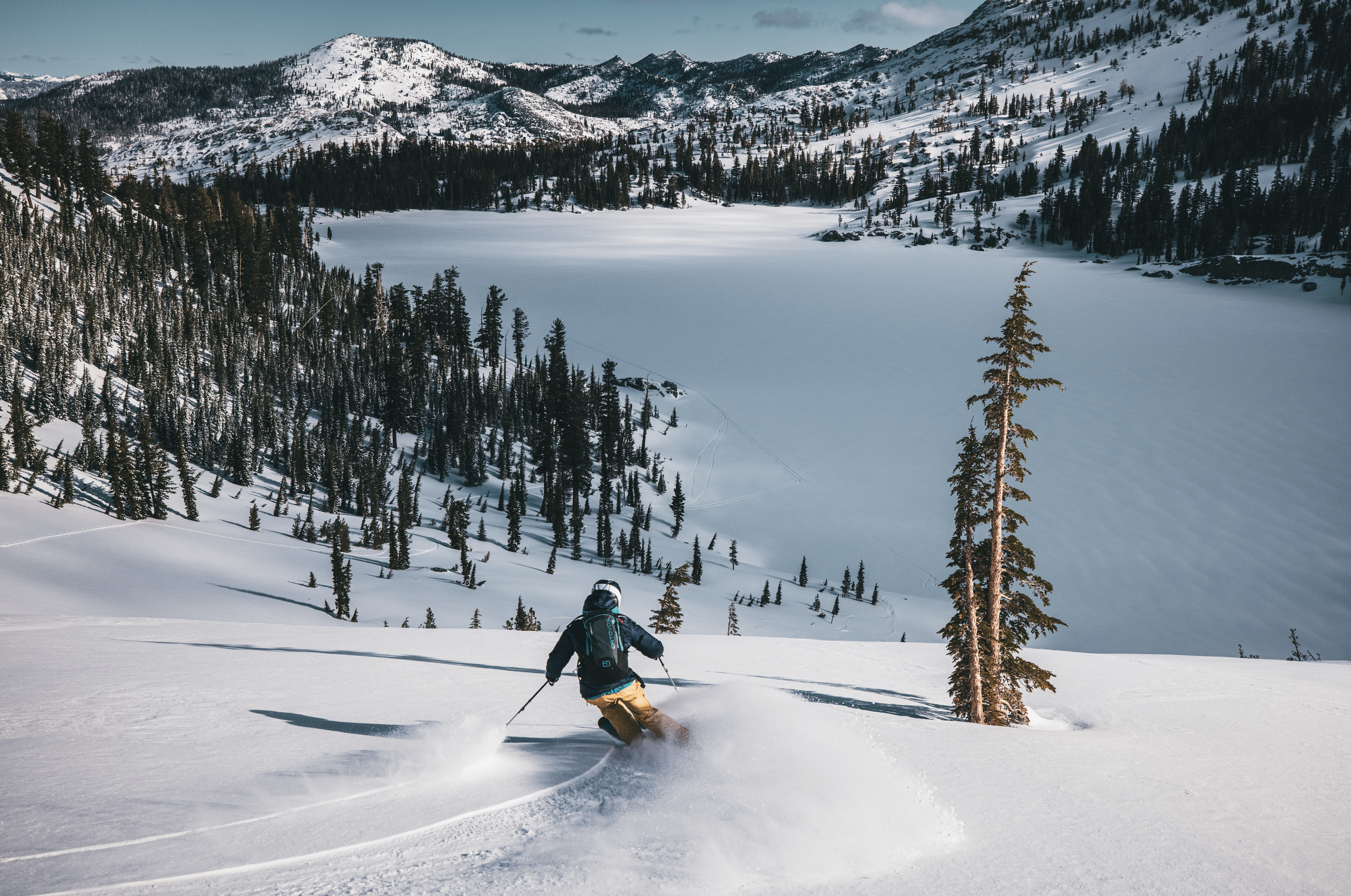
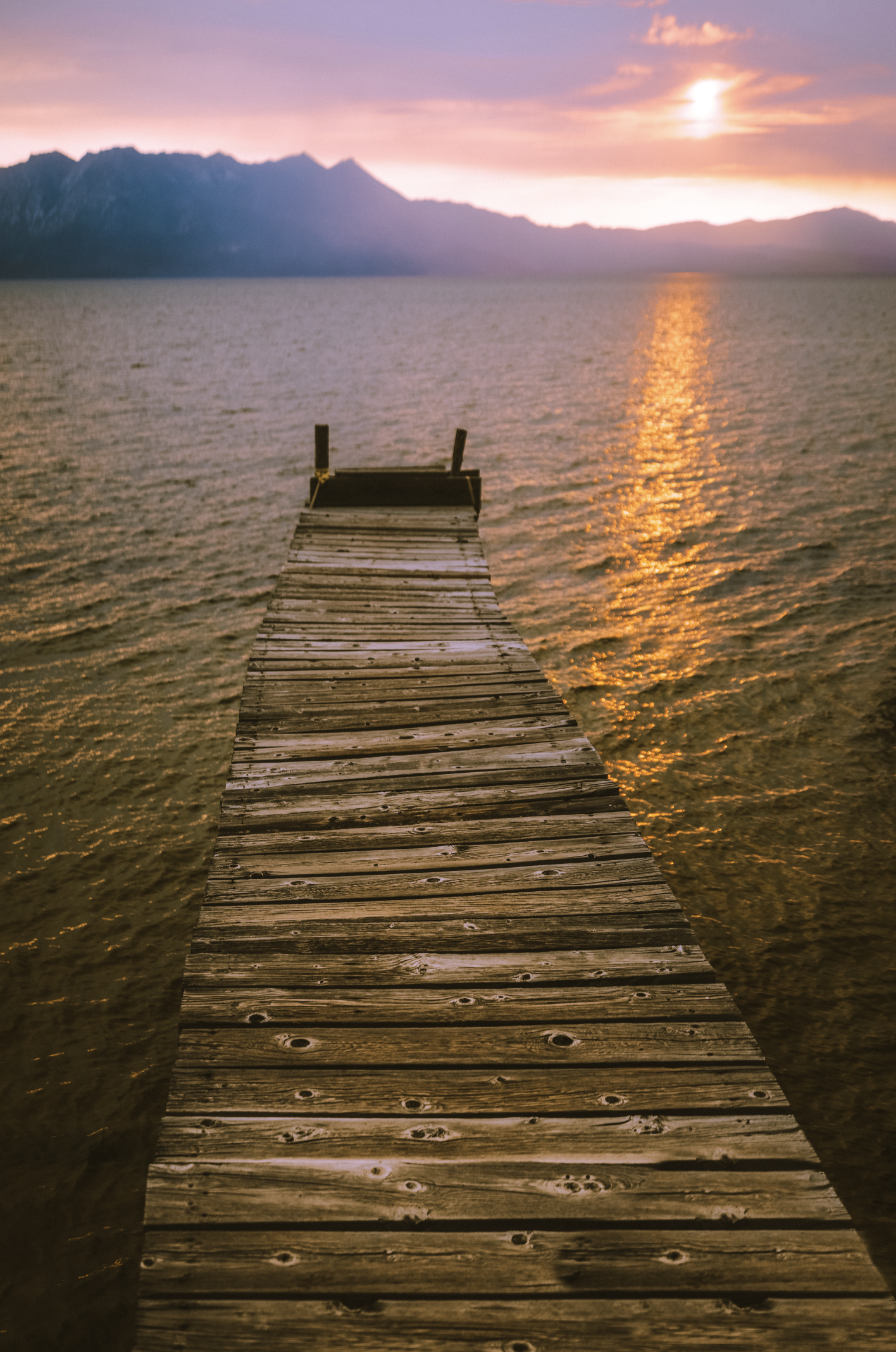
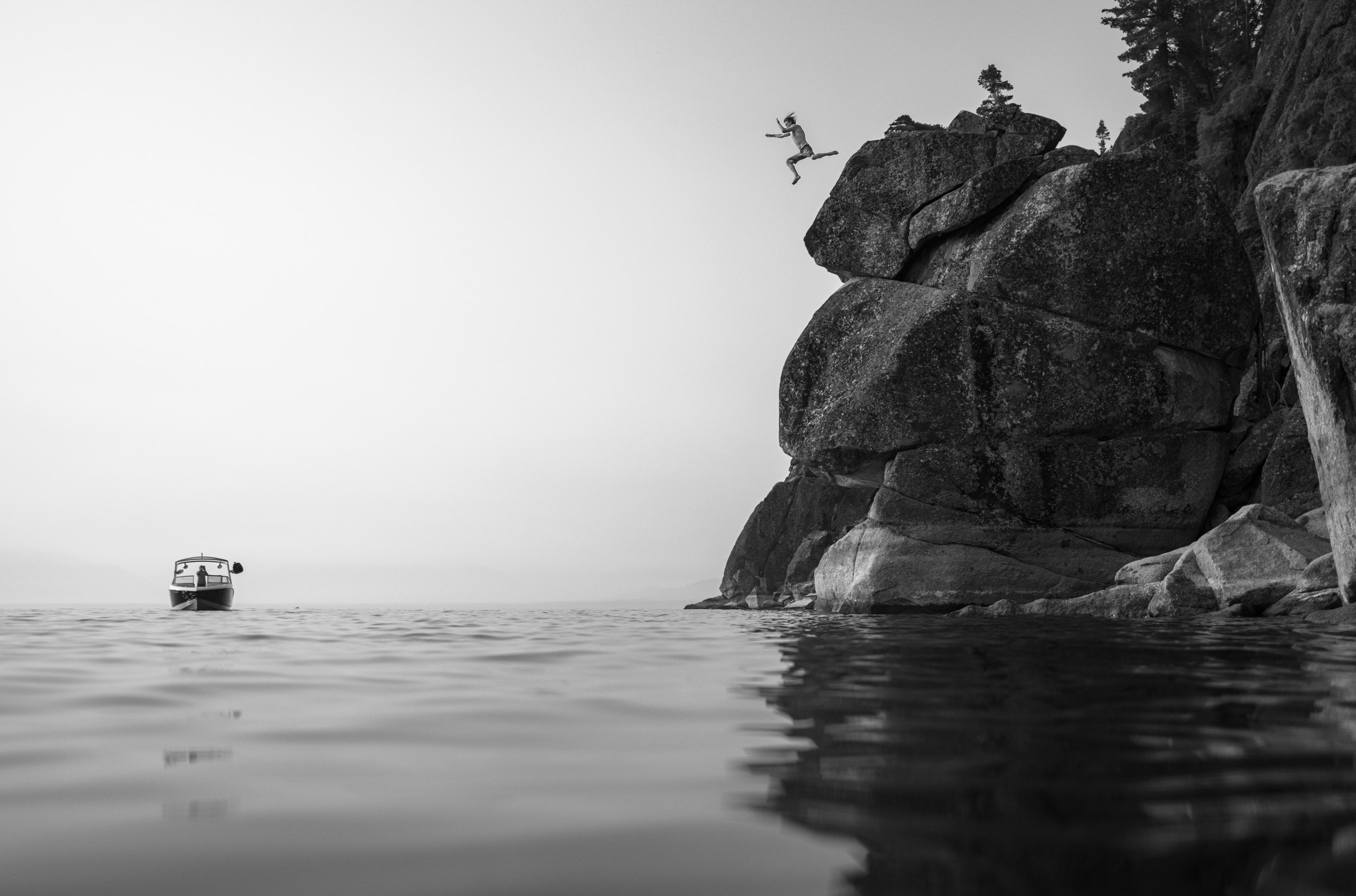
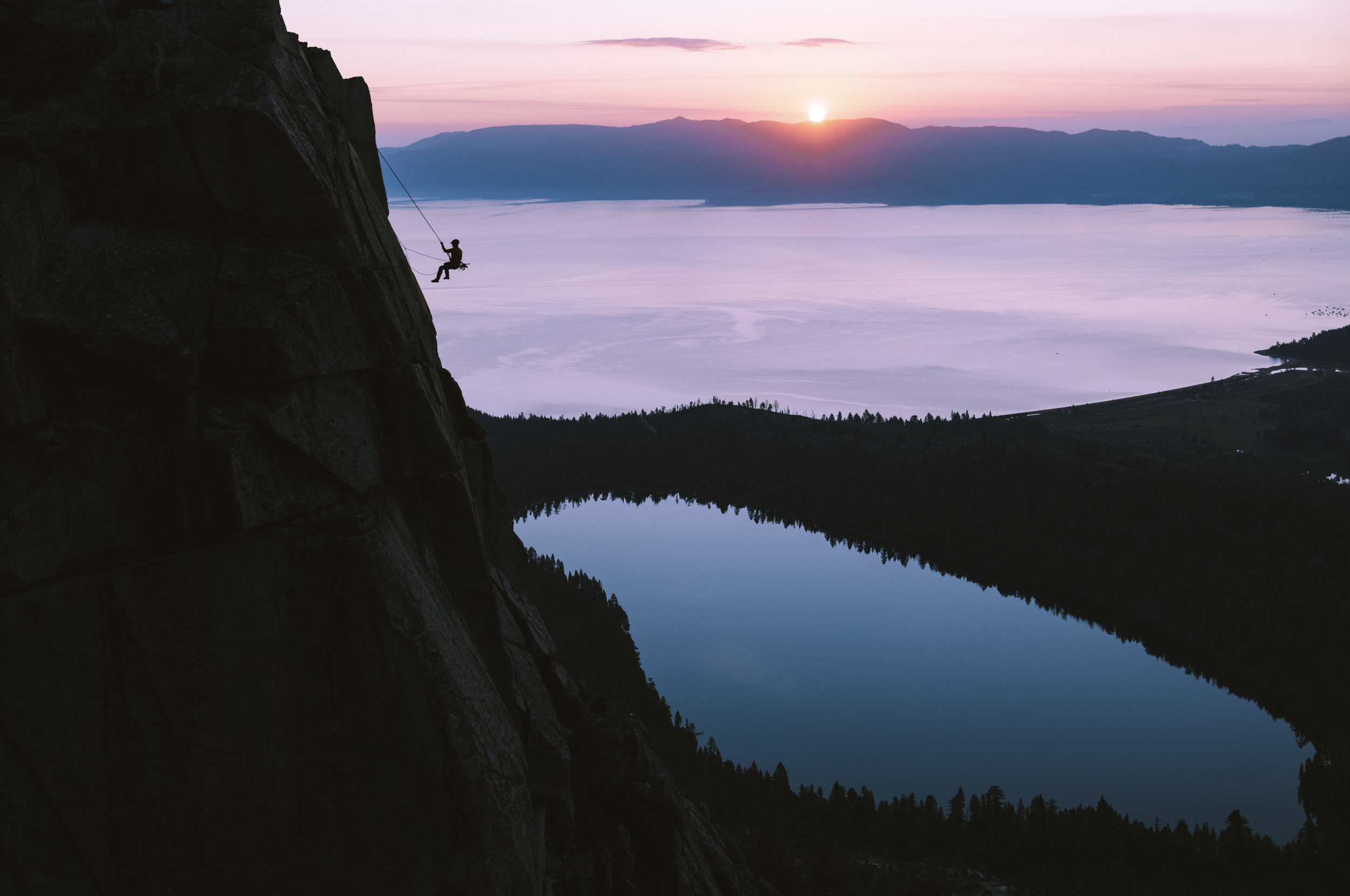

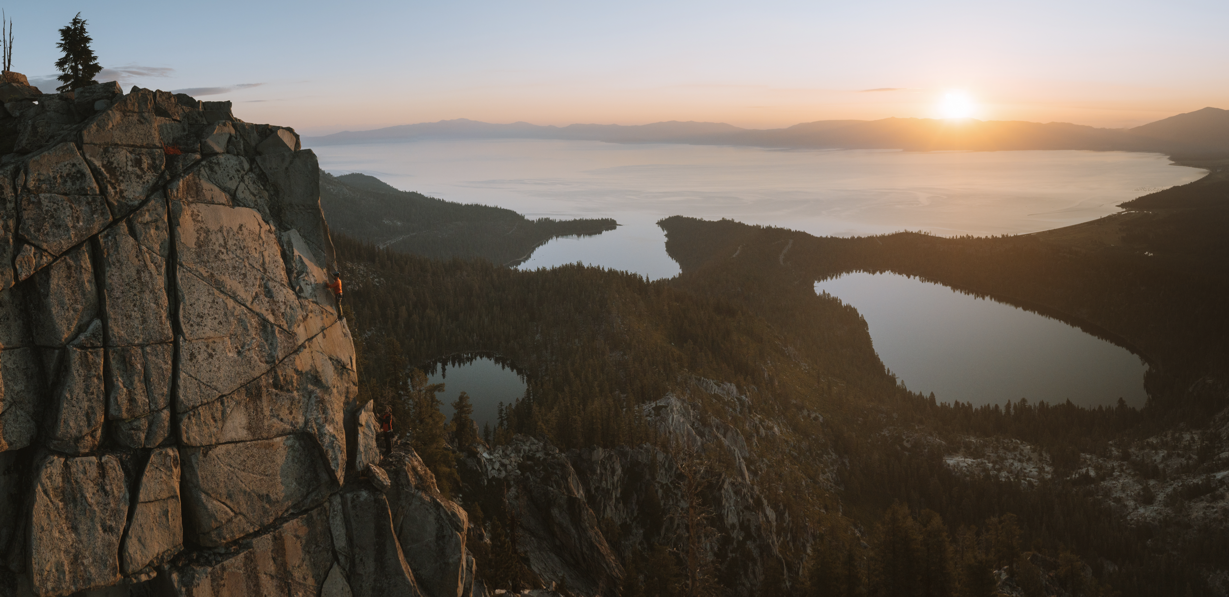
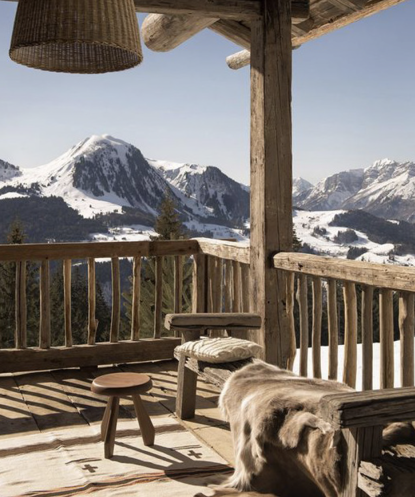
TED HESSER IMAGERY
Maggie’s restaurant
Named in honor of the magnificent Maggie's Peaks, a local mountain grouping, the hotel’s restaurant identity revolves around a captivating fictional character that personifies the essence of "Maggie." Every meticulous design element has been thoughtfully curated to immerse guests in Maggie's narrative. From the decor to the ambiance, each detail encapsulates the spirit and charm of this captivating character. As you enter Maggie's Restaurant, you are transported into a realm where every aspect tells a story, creating an unforgettable dining experience that celebrates the legacy of Maggie and the natural wonders that surround the hotel. Join us at Maggie's Restaurant, where the fusion of imaginative storytelling and exquisite cuisine awaits, inviting you to embark on a journey that transcends the ordinary and embraces the extraordinary.
Maggie's fictional character draws inspiration from the remarkable female climbers and trailblazers of the early 1900s, who defied societal norms and pushed the boundaries of exploration. Among these inspiring figures are the Japanese Women Mountaineers of the early 1900s, who fearlessly tackled challenging peaks and showcased their strength and determination. Annie Smith Peck, a renowned mountaineer and women's rights advocate, left an indelible mark on the climbing world with her daring ascents and her dedication to gender equality. Lucy Walker, the founder of the Ladies Alpine Club in 1907, played a pivotal role in empowering women climbers and promoting their participation in alpine adventures. These trailblazers serve as the foundation for Maggie's character, embodying the spirit of resilience, adventure, and the pursuit of breaking barriers. Through Maggie's story, we pay homage to these inspiring women and celebrate their contributions to the world of mountaineering and exploration.
THINGS ARE LOOKING UP
Perched on the upper deck of the hotel, the restaurant at Desolation Hotel offers a breathtaking vantage point that inspired our tagline: "Things are looking up." As you ascend to this elevated dining experience, prepare to be captivated by panoramic views of the surrounding natural beauty. With each glance, your spirits will be lifted, and a sense of wonder will fill the air. Whether you're enjoying a romantic dinner under the stars or indulging in a delightful brunch with friends, our tagline perfectly encapsulates the uplifting ambiance and awe-inspiring vistas that await you at the restaurant.

Maggie McPeak was a toddler when her family settled in the Lake Tahoe basin. With a precocious nature and an appetite for exploring, her youthful curiosity evolved into a lifelong love of the Desolation Wilderness. As an adult, Maggie was known for her intelligence, charm, and passion for the great outdoors. She was a vanguard for female explorers, tearing down the “rules” for women in the wilderness; Maggie was the first female to ascend nearly every one of the major Western alpine summits.
She was also someone whom everyone admired. Maggie McPeak told the grandest tales, shared the most fascinating facts, and baked the best blueberry buckle in the whole Tahoe basin. Known for throwing impromptu dinner parties for the various travelers with whom she crossed paths, Maggie was endlessly hospitable. As evidenced by the amount of butter she used in her cooking to the number of guests she squeezed around her modest table, Maggie was generous above all else.
More than just an elevated dining experience offering local flavors and warm hospitality, Maggie’s Restaurant represents the essence of our namesake: unique yet familiar, exciting yet comfortable, and endlessly appealing.
Here at Maggie’s Restaurant, “Things are looking up!”


PERSONAL
More than just a business, Maggie’s represents the essence of a person; an inspiring yet relatable individual, Maggie is someone with whom we all wish to form a relationship. As such, we aim to conduct ourselves with a similar warmth and charm when engaging with our audience and our guests.
EXPERIENTIAL
Like the outstanding experiences Maggie created in the Desolation Wilderness, we aim to guide our guests through an informative, enjoyable, and overall memorable dining experience representative of Lake Tahoe’s bounty.
NEIGHBORLY
When the paths of two explorers cross, they never separate. We aim to forge that bond with both the travelers and the locals who choose to dine with us at Maggie’s. Always ready with a hand to help or a book to guide you, at Maggie’s Restaurant, everyone is welcome.
SHARP
The same way one must proceed with care while navigating the Desolation Wilderness, in both our communication and our actions, we conduct ourselves with precision and intelligence at Maggie’s so we can deliver an experience that sparks wonder.


The branding process for Desolation Hotel was an immersive journey that aimed to capture the essence of adventure, nature, and authentic experiences. We began by defining our target audience: the modern adventurer seeking meaningful access to nature without compromising modern amenities. Overall, the Desolation Hotel branding process successfully brought together various elements to create a cohesive and captivating brand that resonated with adventurers seeking remarkable journeys through time and nature.


Monarch Architecture, Sierra Sustainable Builders, Tundish, Ted Hesser, Figure Plant, Rigby Lovett Furniture, Denvir Enterprises, The Ness Group, Laura Pearse of Pique, Maddie Adams of Smudgepot, Madeline Westfall