STORY BEHIND THE BRAND : JAINE


ALL PHOTOGRAPHY BY KARA MERCER
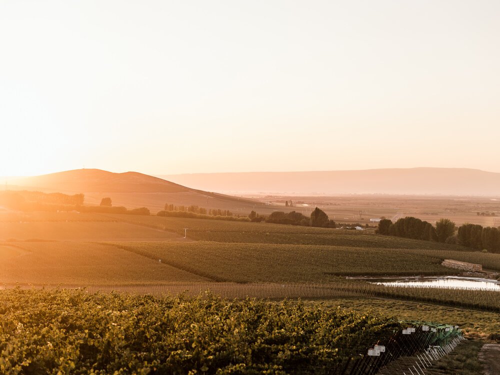
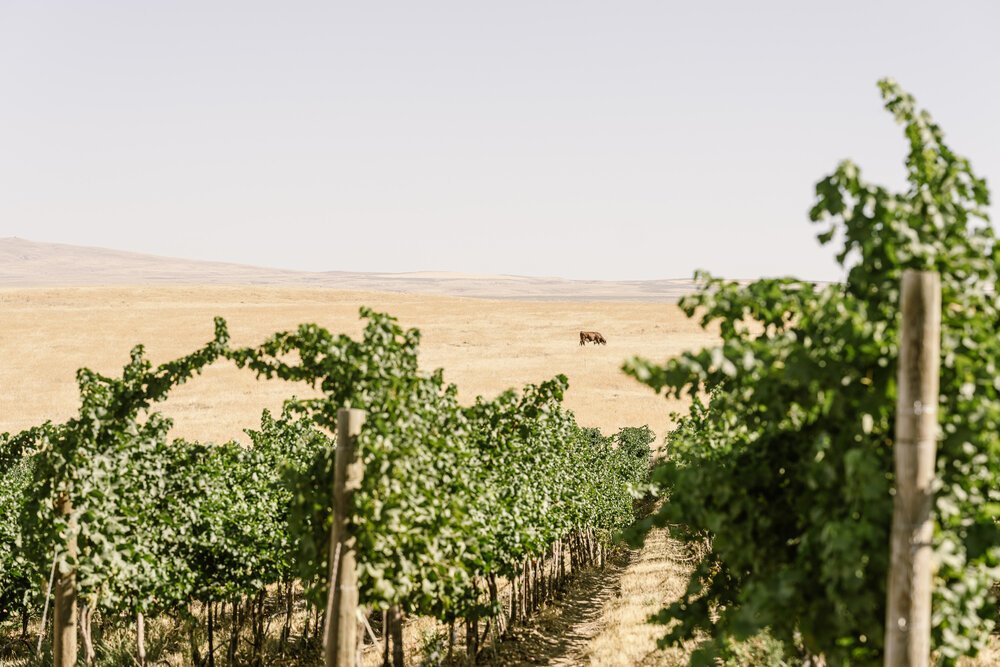
Crafted from single-vineyard sites in the Yakima Valley and Royal Slope region of the Columbia Valley, each vintage is made from a limited supply of hand-picked grapes and thoughtfully produced using sustainable farming practices with minimal intervention.
From the initial phone call, I knew this project would be one for the books. Bryan, the owner, hails from a prestigious Washington winemaking family that crafts incredible wines that are deep and complex, from grapes grown by the most iconic vineyards in Washington. We met at their Woodinville organic farm and sat at a little table in the garden, with a view of the tasting room, bed and breakfast, and the sprawling land behind it.
He explained that wine-making decisions, for most of history, have been made by men. Winemakers, wine critics, and sommeliers have historically been positions held by men. Women, however, are often the ones making most of the purchasing decisions around wine. They are the ones having a glass of rosé over lunch with a girlfriend, developing a dinner menu and pairing a cab franc with the slow-cooked short ribs course they have prepared, and popping champagne for toasts and celebrations.
With that information, he charged me with a dream scenario - “create a wine brand that you’d be proud to say you created, as well as a wine you’d be proud to have on your table for a dinner party.”
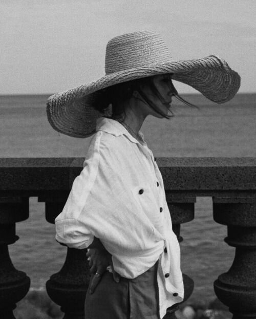
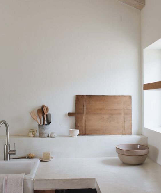
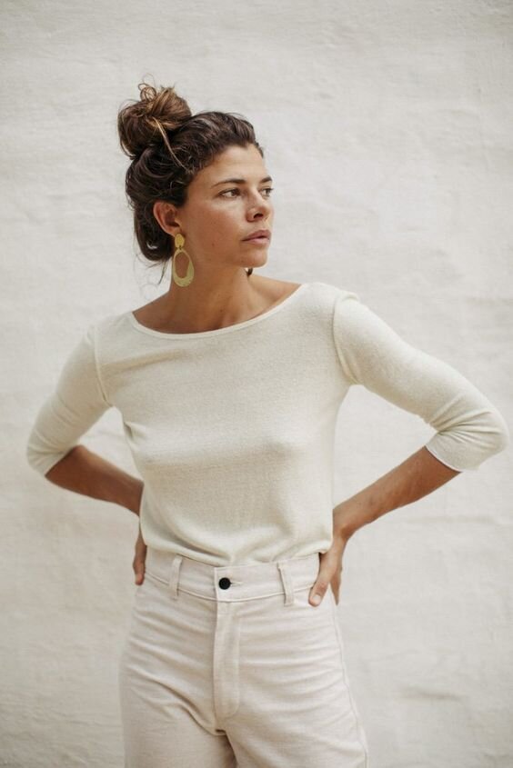
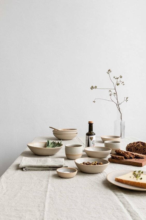
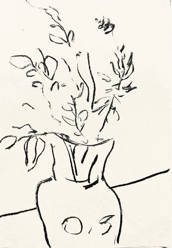
Initial Pinterest Inspiration (ORIGINAL SOURCES UNKNOWN)
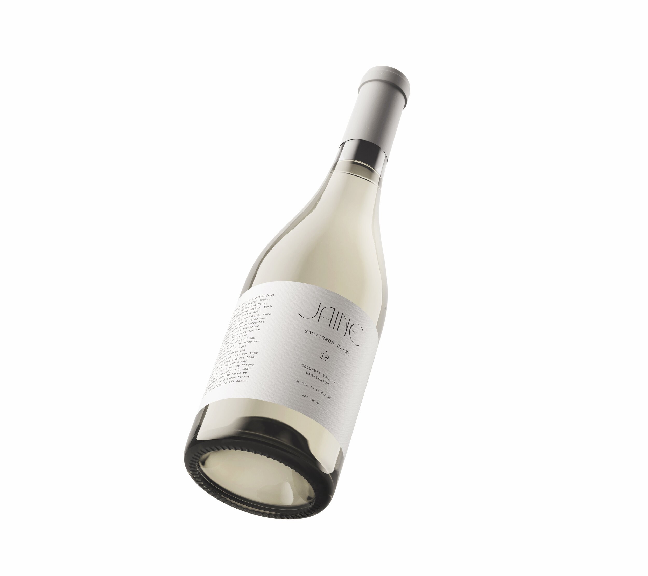
Jaine is more than a wine brand. It’s a winery that focuses on crafting the best possible wines from select vineyard parcels throughout Washington State. Each vineyard practices sustainable farming using organic methods. The grapes are hand-harvested in the early morning and hand-sorted when they arrive inside the winery. By the time the wine is bottled, it has been evaluated by the winemaker between 40 and 50 times.
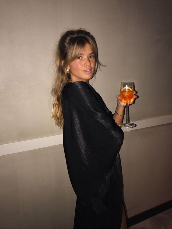
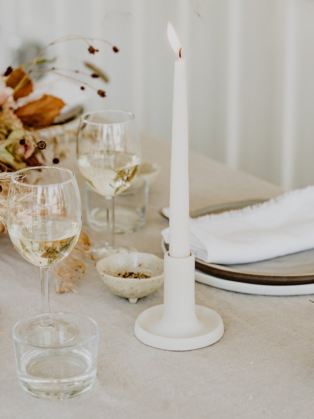
As we developed the Jaine brand strategy, a lifestyle brand emerged. We were solely focused on WHO Jaine represents. And thus, the #SheisJaine muse was born, a woman who encourages others to live well and a woman who lives with intention and surrounds herself with aesthetic inspiration. The brand became not only a wine, but a platform for women to connect, share stories, and build relationships. Thankfully we had the brilliant Chloe, from Gather Seattle, whose gift in life is to build community.
And so, we set out to design a brand that’s sophisticated, light, aesthetically beautiful, unique, fresh, and different. A brand that is product-driven, yes, but moreover inspires a life well-lived.
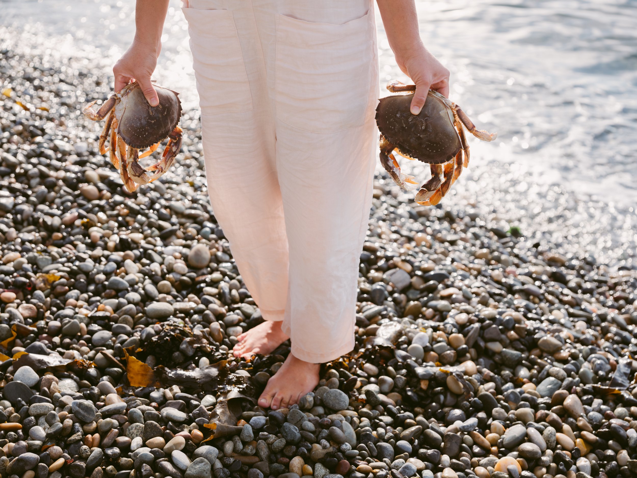
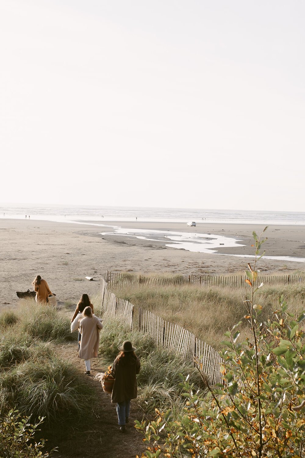
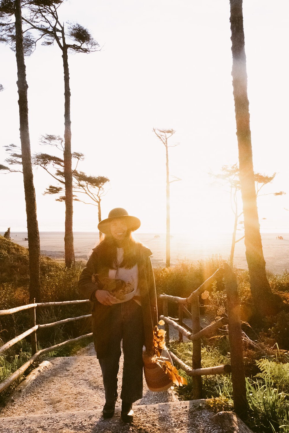
While I developed the visual identity, Chloe set off with the amazingly talented Kara Mercer to create brand imagery that told the story of Jaine. They hosted vineyard picnics, celebratory dinners, and weekend getaways with women who embody the Jaine principles.

I dove in, faced with the challenge of building something innovative. We began with high level branding and mood inspiration. Beginning the process by exploring all of what currently exists in the landscape of wine branding. We carefully identified the brand strategy - from audience, tone, mood, and messaging.
As I began to develop the design, Bryan noted something unique that, even in my obsessively design-aware state, I had never noticed. He pointed out that historically, there have always been underlying design factors that tell the buyer what it is they are about to consume. Tapping into color theory, he explained that winemakers typically use subliminal color in their labels. Most sauvignon blanc labels use some sort of fresh green tone somewhere in the design. Rosé labels typically utilize white, black and silver to highlight the pink tones of the wine itself. Most red wines use red tones in the label design. Winemakers essentially use color to tell the story of what we’re about to enjoy.
Given that I live with a sommelier, we had no problem digging into more of this research. Another element of this investigation was the newly popular culture of organic wines, clean wines, natural wines, and vegan wines - it was imperative that this brand did not become lost in the trendy sea of vino.
The brand themes that kept circulating around Jaine were:
Unique / Special / Light / Women / Sophisticated / Connection / Beautiful / Gathering
One of the initial concepts, inspired by the Roman Goddess of Abundance who is holding the horn of plenty, had a hand-drawn mark of this mythological female. This embodied all of what Jaine stands for. Abundance and plenty, not simply in the literal sense of the crop, but the overflowing nature of how Jaine inspires us to treat one another. Jaine wines should be enjoyed over feasts with friends and encourage community. She held the horn of plenty close, almost fawning over it and all of the meaning associated with it. While the heart of this rings true, it did not resonate visually for the audience we set out to align with. This mark was paired with the type treatment that ended up being the final Jaine logotype, so not all was lost.
There are, on occasion, times when pieces of concepts work - and others do not. I have dubbed this part of the process “Frankenstein-ing” - taking colors from one concept - pairing them with type from another. It’s always necessary to distill down to the absolute most ideal visuals and the reasonion behind my “front heavy” design process. Every client is delivered a three-concept presentation, where three separate brand concepts are created from the strategy we’ve laid as groundwork. Each concept includes logo, type treatments, submarks, moodboard, color palette, mockups for website and packaging applicable to the business. I have found that while it is a heavy lift on the front end, the process is smoother, and more enjoyable, and 99.9% of the time the client has the “that’s it!” moment.
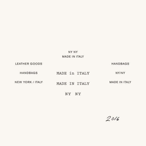
Typography
Varying type treatments were presented, and while this was a strong contender, it will be forever lost in the “Pretty Little Rejects” archive.
Introducing Jaine, the brand.


There were too many iterations of this label to count, and while there’s no use in describing every variation in detail, it is worth noting that often times print design is incredibly complicated. When we finally arrived on a label design - quarantine hit and the only printer who could execute the layering effect we had initially opted for, shut down, leaving us to redesign.
After months of development, I had the opportunity to completely reset and breathe new creative life into the project. This resulted in a change in type treatment and layout. The creative process is rarely linear and always comes with curveballs. It may have been a blessing in disguise because I adore the finished product.


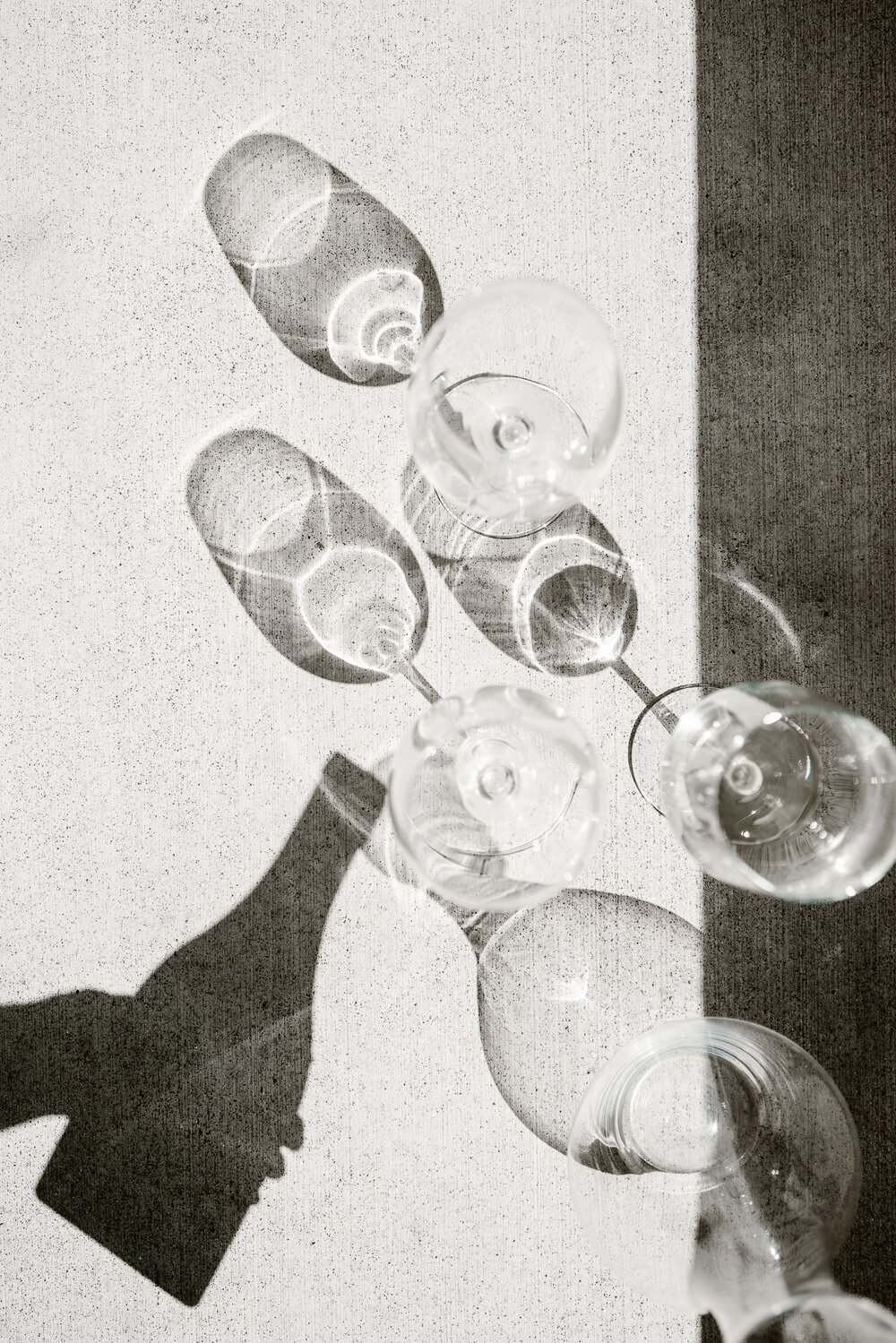
Jaine is a toast to life’s most beautiful moments.
These days, you can pop into the Jaine Cottage in Woodinville, Washington, and experience it for yourself.